Working with Charts
This page shows a practical chart workflow from start to finish.
You will define a minimal data model, fill it with sample data, create a chart template manually, and place LINQ Reporting tags in the chart data worksheet.
Define a Simple Data Model (For This Article)
Use a dedicated model that mirrors a single chart with one category axis and one value series:
using System.Drawing;

public sealed class SalesChartPoint
{
    public string Month { get; set; } = string.Empty;
    public decimal Amount { get; set; }
    public decimal Target { get; set; }
    public decimal Forecast { get; set; }
}

public sealed class SalesChartReport
{
    public string Title { get; set; } = string.Empty;
    public bool ShowForecast { get; set; }
    public List<SalesChartPoint> Points { get; set; } = new();
}
Fill the Model with Sample Data
Fill the Simple Data Model:
SalesChartReport report = new SalesChartReport
{
    Title = "Monthly Sales (USD)",
    ShowForecast = true,
    Points = new List<SalesChartPoint>
    {
      new SalesChartPoint { Month = "Jan", Amount = 12000m, Target = 13000m, Forecast = 12500m },
      new SalesChartPoint { Month = "Feb", Amount = 17650m, Target = 17000m, Forecast = 16800m },
      new SalesChartPoint { Month = "Mar", Amount = 15400m, Target = 16000m, Forecast = 15800m },
      new SalesChartPoint { Month = "Apr", Amount = 20100m, Target = 19500m, Forecast = 19800m }
    }
};
Build a Template with a Chart (Step by Step)
Use this sequence to make a chart data-driven while keeping tag placement predictable:
- Insert a chart where it should appear in the result document
- Set chart look-and-feel first (type, legend, palette, labels) before adding tags
- Create or adjust series placeholders that will receive dynamic values
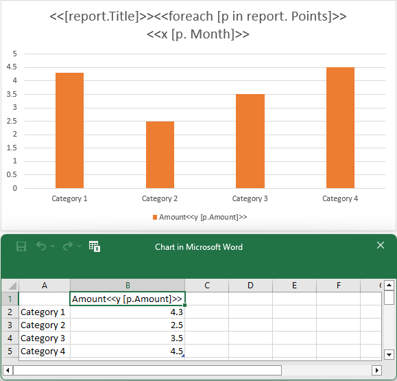
- Ensure the chart has a title text area; the opening
foreachtag is placed there - Depending on chart type, add
xtags to chart title or series names:- Scatter or bubble chart:
Use either one shared
xtag in chart title, or onextag per series namexmust return a numeric value - Histogram chart:
Use
xvalues onlyxmust return a numeric value - Treemap or sunburst chart:
Put
xin chart title for leaf labels (xmust return a string) Addx2andx3in chart title for higher hierarchy levels (x2andx3must return strings) - Other chart types:
Use one
xtag in chart titlexcan return numeric, date, or string values
- Scatter or bubble chart:
Use either one shared
- For non-histogram charts, add
ytags in series names (ymust be numeric) - For bubble charts, add
sizetags in series names (sizemust be numeric)
Chart regions use an opening foreach only. A closing foreach tag is not used inside charts.
For the column-chart example in this article, use one x tag in the title and one y tag in the series name.
Chart template example:
Fill template with data:
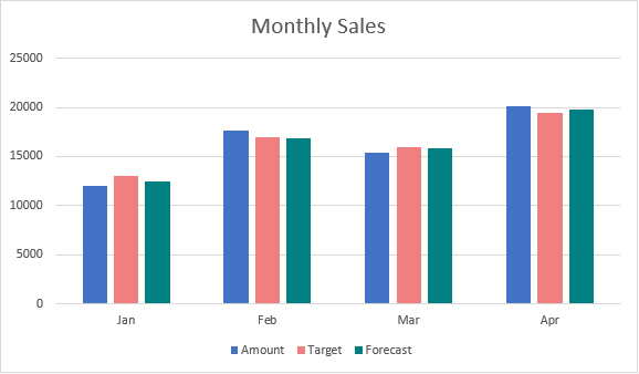
ReportBuilder.BuildReport("template.docx", "result.docx", report, "report");After generation, the chart categories are Jan, Feb, Mar, Apr and the values are 12000, 17650, 15400, 20100.
Chart result example:
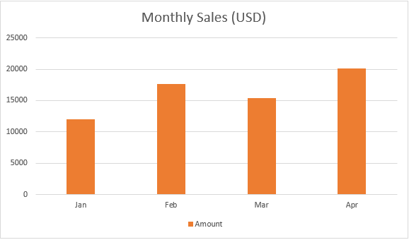
In this example, the chart title is populated dynamically from the data model with the standard <<[report.Title]>> tag. If you prefer, you can also keep the chart title static and enter it as ordinary text in the template.
Set Chart Point Colors Dynamically
You can color individual bars dynamically using the pointColor tag in a chart series name.
Tag syntax:
<<pointColor [color_expression]>>color_expression can return one of the following:
- A known color name string (for example,
"Red"). - An HTML color code string (for example,
"#F08080"). - An integer RGB value (for example,
0xFFFF00). - A
Colorvalue.
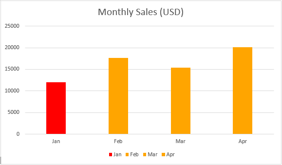
In this scenario, the bar with the minimum value is colored red. The following pointColor tag is used:
<<pointColor [report.Points.Min(point=>point.Amount)==p.Amount?"Red":"Orange"]>>Chart template example:
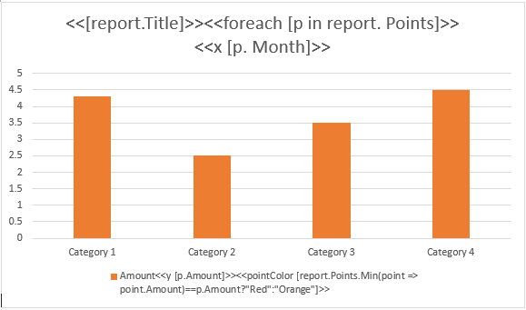
Chart result example:
In the generated chart, the minimum bar (Jan, 12000) is red.
Set Chart Series Colors Dynamically
You can color entire chart series dynamically using the seriesColor tag in a series name.
Tag syntax:
<<seriesColor [color_expression]>>Supported color value types are the same as in Set Chart Point Colors Dynamically.
The first series uses the default color. The second and third series use the color specified by the seriesColor tag. Alternatively, series colors can be obtained from the data source.
Chart template example:
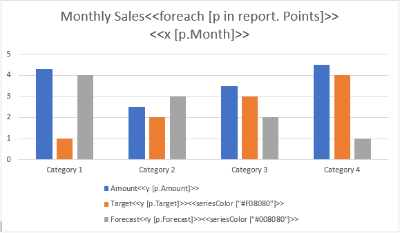
Chart result example:
Include Chart Series Dynamically
You can include or exclude chart series dynamically using the removeif tag in a series name.
Tag syntax:
<<removeif [conditional_expression]>>conditional_expression must return a Boolean value.
In this scenario, report.ShowForecast controls whether the Forecast series is visible:
- If
report.ShowForecastistrue, the series is included. - If
report.ShowForecastisfalse, the series is removed.
Use removeif on the Forecast series name like this:
<<removeif [!report.ShowForecast]>>Chart template example:
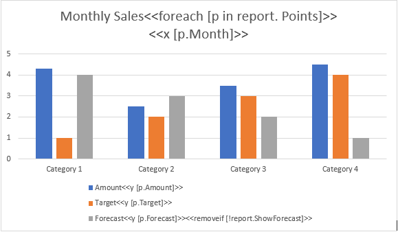
Chart result example (report.ShowForecast=true):
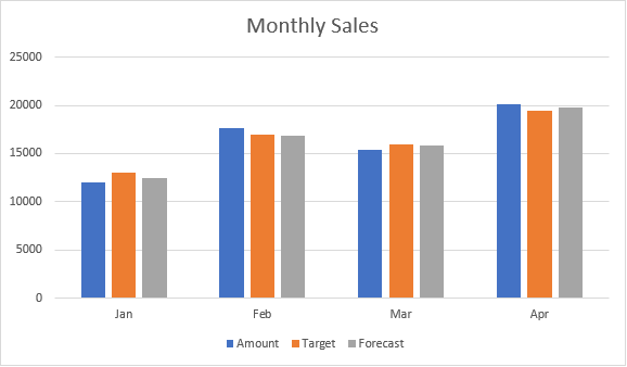
Chart result example (report.ShowForecast=false):

Related Topics
- Working with Tables
- Queries and Control Flow
- Document Layout Patterns
- Troubleshooting and Best Practices